
1001 Fondues Unveils Its New Visual Identity
The year 2026 marks a major milestone for 1001 Fondues, which is proudly celebrating its 40th anniversary. After decades of showcasing the richness of our local cheese fondue tradition, 1001 Fondues unveils its new visual identity — a thoughtful, confident evolution rooted in what defines it most: indulgence, conviviality, shared pleasure and, of course… effortless happiness.
This transformation goes far beyond a simple aesthetic refresh. It reflects a clear intention: to let the soul of 1001 Fondues shine with even more flexibility, warmth, modernity and personality. The time had come to give the brand a memorable, unifying visual signature — one designed to stand the test of time.
Why a New Visual Identity?
Like any living brand, 1001 Fondues evolves. Over the years, the company has expanded its offering, refined its positioning and strengthened its place as a Canadian leader in artisanal cheese fondues. Updating its visual identity with added flexibility was the natural next step. The moment had come to modernize the brand image and offer 1001 Fondues a fully revamped visual identity — while preserving its authenticity, accessibility and joyful spirit.
Building the Next Chapter Together
To bring this transformation to life, we partnered with the creative agency 21g — a team with whom we’ve built a genuine bond over the years. Together, we defined the following objectives:
- Evolve the brand identity toward a more contemporary direction, in harmony with its DNA.
- Enhance visibility, flexibility, aesthetics and modernity across the entire brand image.
- Highlight the decadent, accessible, friendly and joyful character that defines 1001 Fondues.
- Create a memorable, unifying visual identity designed to endure with elegance.
Daring More, While Honouring the Essentials
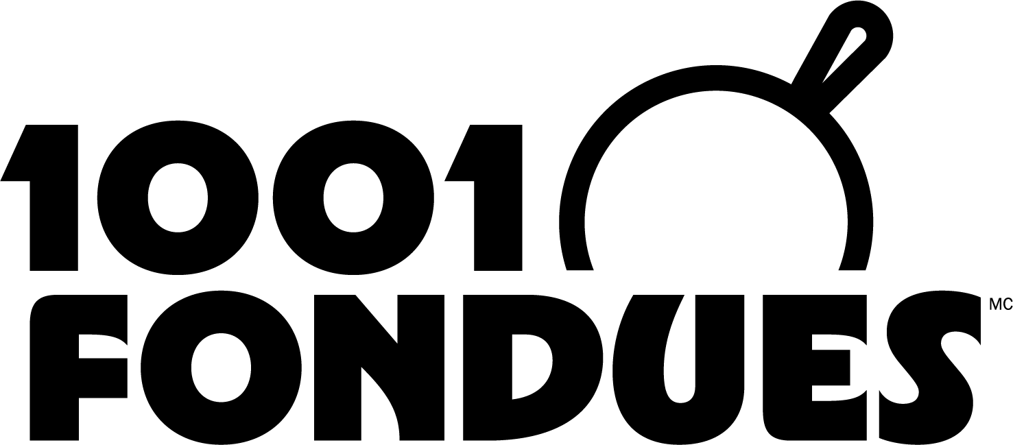
In this new iteration, one key element remains: the fondue pot. A true emblem of 1001 Fondues, it embodies conviviality, sharing and the human warmth that defines us. There was no question of letting it go — and no reason to. It remains at the heart of the logo, now in a more contemporary form.
Historically, the 1001 Fondues logo featured a top‑down view — a nod to our roots as restaurant owners, since when we placed a classic “caquelon” (pot) on the table, that was exactly the perspective we saw.
The boldness expresses itself elsewhere: in a melting, indulgent, slightly retro typeface that evokes both the velvety texture of fondue and a comforting touch of nostalgia. This new identity fully embraces what 1001 Fondues has become: THE go‑to brand for local cheese fondues — proud, accessible and deeply rooted in its terroir.
A Signature That Brings People Together for the Long Term
With this redesign, 1001 Fondues isn’t simply turning a page — it’s opening a new one. A page that is more current, more expressive and more faithful than ever to its mission of creating warm, authentic, flavourful and deeply unifying moments.
The 2026 visual identity is, yes, a new logo. But above all, it is a clear statement designed to evolve with the brand. A reaffirmed promise. An invitation to share, to come together and to celebrate the beauty of being together.
To our long‑time fans: rest assured — you won’t be unsettled, but rather charmed by this natural evolution, true to the spirit of 1001 Fondues. At least, that’s what we like to claim — with plenty of enthusiasm…